Recipe based web app for real foodies. Front-end built using CSS Grid, Flexbox & vanilla JS with structural HTML, SEO optimization and structured data.
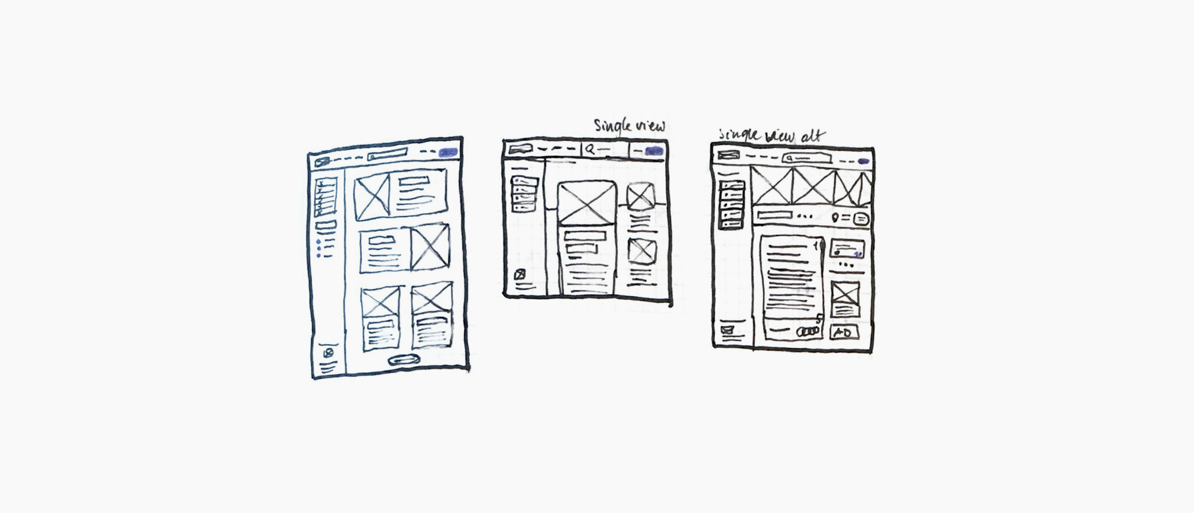
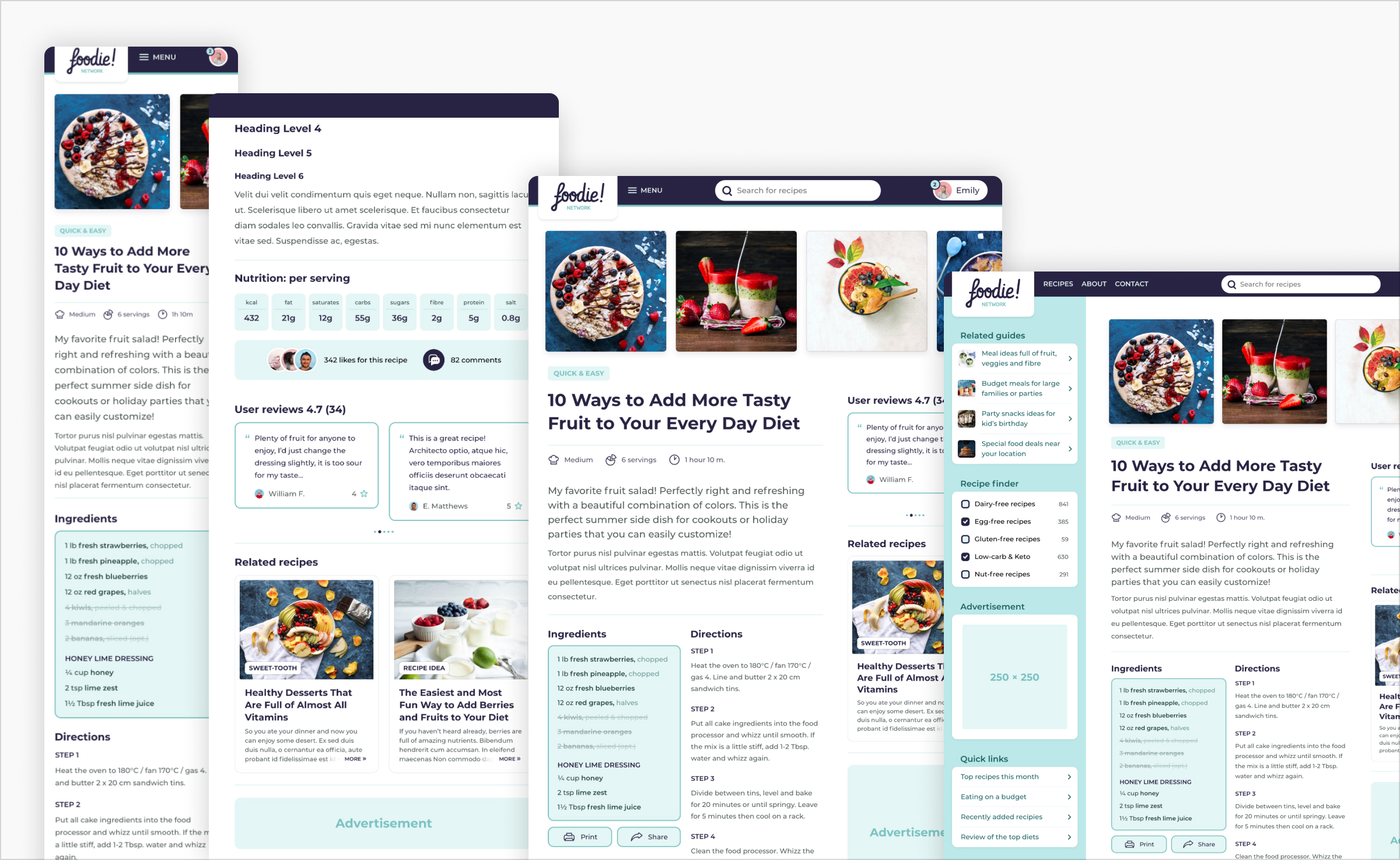
This little project was created to explore all the possibilities of CSS Grid and Flexbox layout tools in CSS. I quickly sketched out a little wireframe on a piece of paper that would consist of all the challenging layouts that can now be achieved with CSS Grid and Flexbox. The layout I came up with was very similar to a typical web app and an idea for a recipe finding network was born.
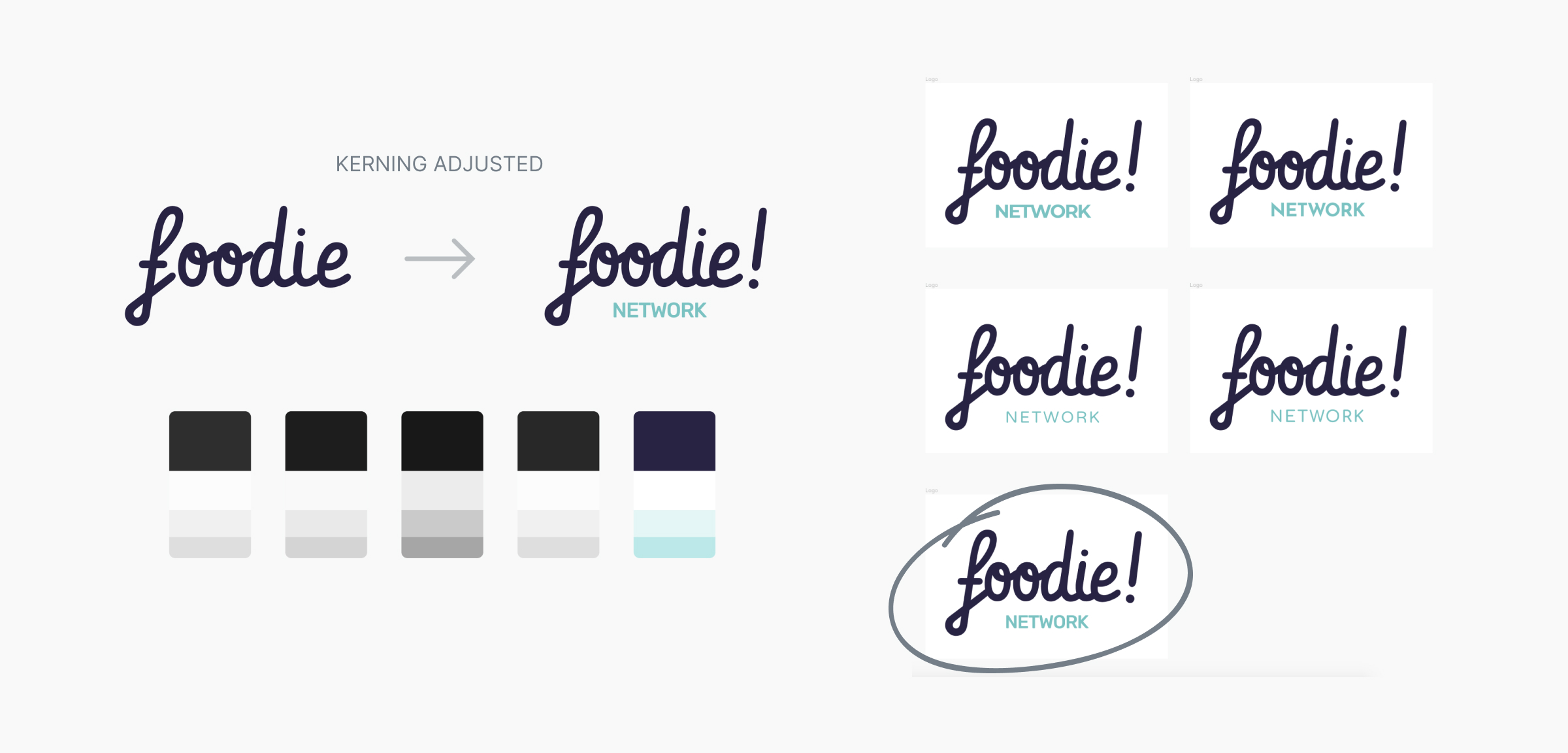
After I decided on the layout, the next step was creating a fictional brand that would reflect the spirit of the site. To come up with the overall feel of the design I created a little moodboard in Figma that consisted of related logos, pictures, fonts and color schemes.
Next, through the elimination of fonts and color schemes, I found the perfect fit and the foodie brand was created. All fonts used in this design are free Google Fonts (Vibur+Rubik & Montserrat) so I had to get a bit creative with the kerning to achieve the desired output.
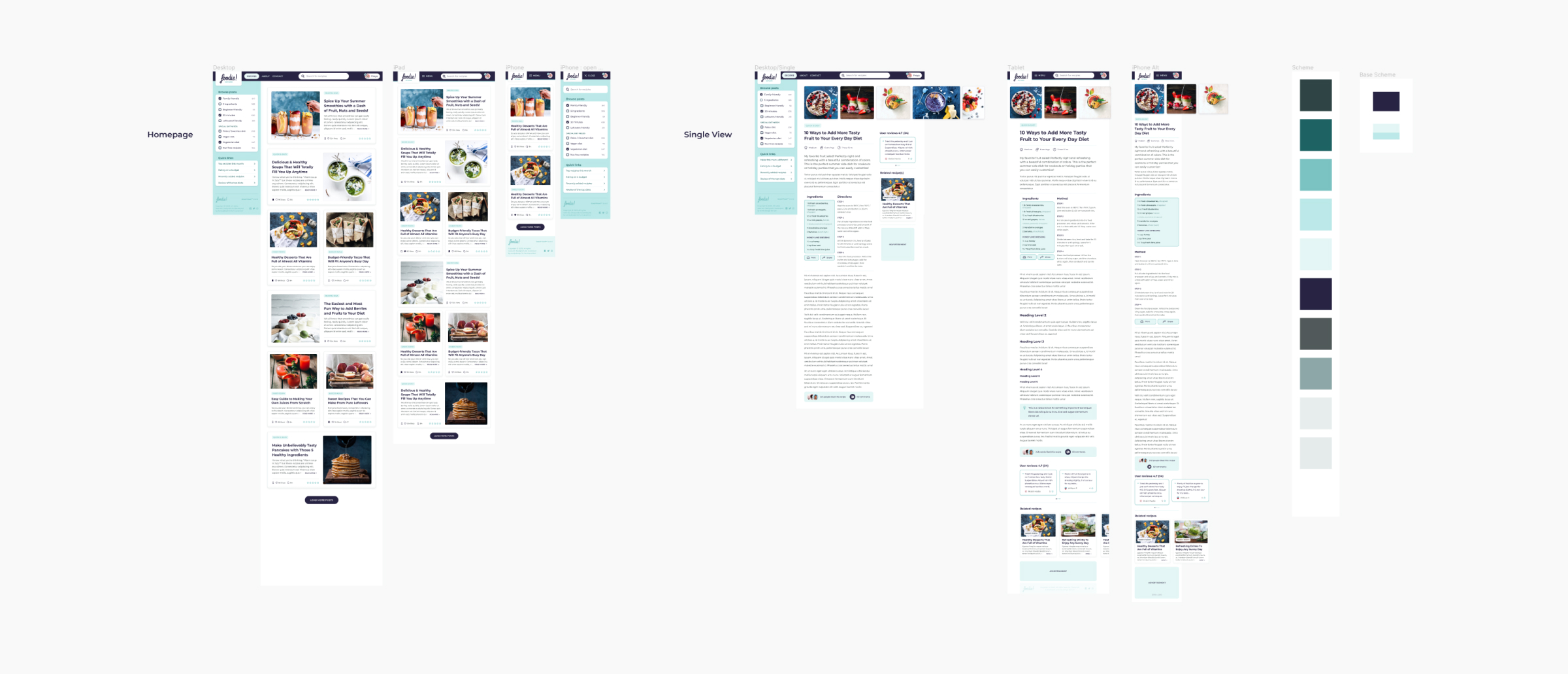
Once I had a solid grasp of the brand style I began creating the design in Figma. Guided by my sketches and wireframes I began creating the outlines of a design. At this stage, I also created additional colors for the UI based on the original color palette.
I like to start my designs with a desktop view first and then go down to the tablet and mobile viewports. That way I can make sure that mobile device users aren’t missing out on any content. It’s also important for me to test the design on my smartphone and tablet with Figma prototyping features to ensure that all the buttons are clickable and the site is clean, concise and user-friendly.
In order to make the development setup process faster, I assembled a small but flexible boilerplate framework that uses Node & NPM to create a flexible and familiar development environment to work with. I simply clone said boilerplate with every project and extend it according to the particular project needs.
This project makes use of gulp.js as a task runner to automate the process of minifying, prefixing, parsing SASS files and to optimize and resize all the graphics for responsive images. I also used Babel to convert ES6 JavaScript and gulp-uglify to reduce the file size.
To instantly preview changes I used the BrowserReload module. After everything was set up, I began to create and categorize all .scss files according to the 7-1 folder structure. I also used git with GitHub to keep track of all the changes.
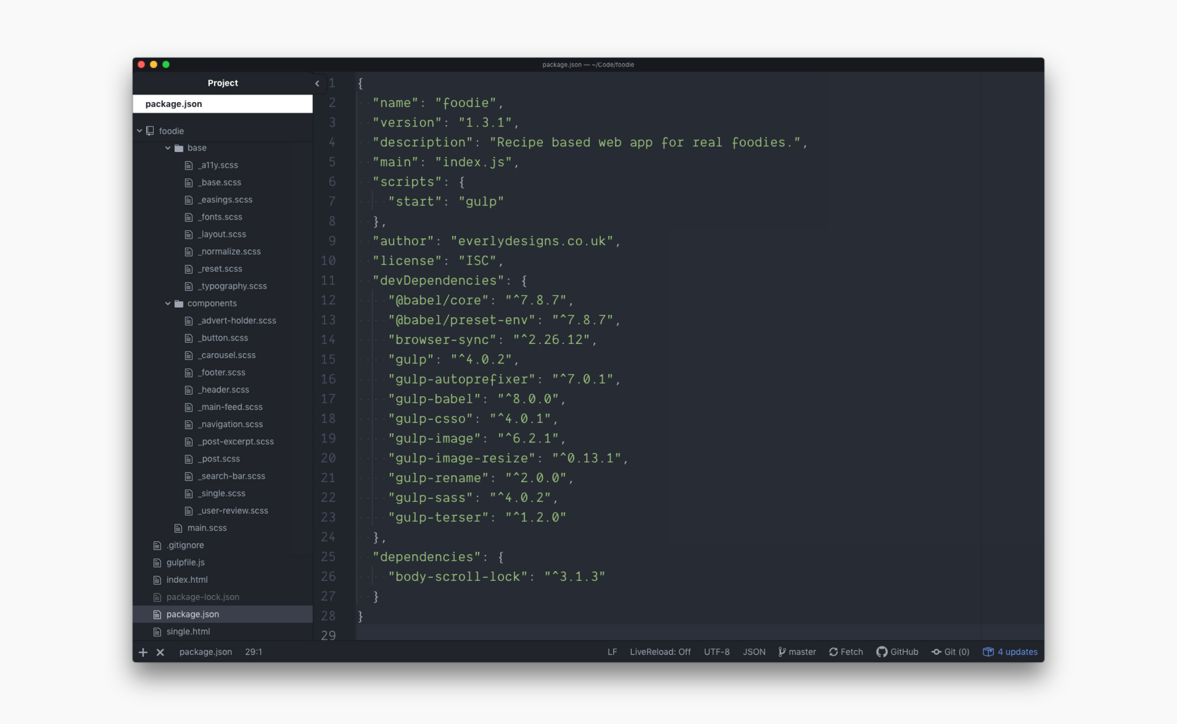
In most cases, the actual site development starts with creating the HTML structure. While this phase may seem trivial, HTML is really just a markup language, I like to make sure that every element has a semantic purpose. I try to follow the latest conventions on the use of HTML5 tags, for example, h1-h6 tags that follow site structure, not heading size or the valid use of header and footer tags inside section or article tags. This is the part where I also add classes following the BEM (Block, Element, Modifier) methodology.
Next, following the 7-1 folder structure, I begin the styling part of the website by breaking down every section or module into a separate SCSS file, that way, finding a relevant piece of code is always easy.
All my websites follow the mobile-first approach to web development. That means, I start styling the elements for mobile devices first and add more code as the viewport gets wider. In doing so it’s easy to ensure that the mobile version of the site isn’t a hurried after-thought but it also means that mobile devices don’t have as much code to load, which ultimately means that the site will load more quickly.
Once the site is styled I then add relevant functionality. This project uses vanilla JS for all its functionality. Sometimes, my projects require the use of a 3rd party library, like in this case Swiper.js, to add extended functionality. I can easily follow the documentation to ensure that the library works well with my site and behaves as intended by the author.
Additional knowledge of JS and CSS also allows me to debug any issues that may arise while implementing the 3rd-party library.
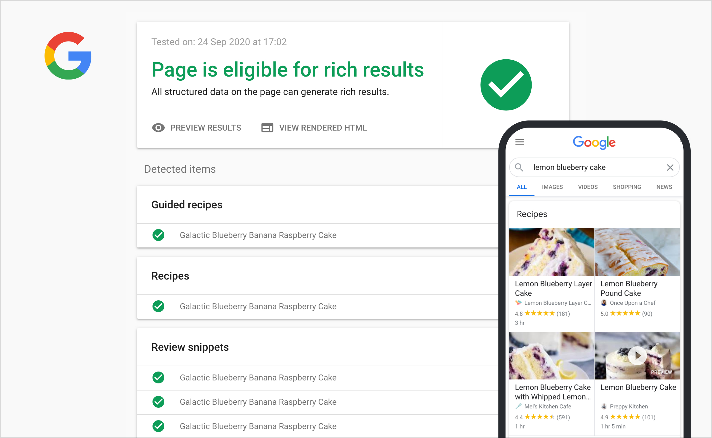
As this is a recipe sharing site, it was very important for me that the search engines can understand the content that is published on the platform. This kind of SEO optimization will not only allow us to drive more traffic to the site but also help our visitors use our recipes on devices like Google Home Hub or Google Assistant.
If you’re interested in this project further, make sure to check out the GitHub repository for it. I made this project temporarily public so you can preview any aspect of my code and see if I’d be a good fit for your company:
Hope you enjoyed this little case study! If you like what you saw, please don’t hesitate to reach out to me! This also applies if you have any feedback! I’m always happy to learn from others and improve my work. You can use the form below to get in touch or you contact me in other ways:
Email me: peter@everlydesigns.co.uk
Phone/Text/WhatsApp/Telegram: +44 7762 397190